import matplotlib.pyplot as plt

# Sample data
x = [1, 2, 3, 4, 5]
y = [1, 4, 9, 16, 25]

# Create a figure and axis
fig, ax = plt.subplots()

# Plot data
ax.plot(x, y)

# Show the plot
plt.show()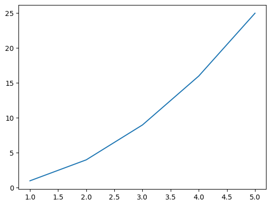
Data visualization plays a crucial role in data engineering for several reasons:
Simplifying Complex Data: Data visualization simplifies large and complicated datasets by representing them in a visual context. This makes it easier to identify patterns, trends, and outliers in the data.
Faster Decision Making: Visual data is processed much faster by the human brain than textual data. Therefore, data visualization can lead to quicker decision-making and problem-solving.
Identifying Patterns and Relationships: Data visualization can help to identify patterns, correlations, and trends between various data points. This can be particularly useful in predictive analytics and machine learning.
Data Storytelling: Data visualization can be used to tell a story, making it a powerful tool for presenting data in a way that is impactful and easy to understand.
Matplotlib is a plotting library for the Python programming language and its numerical mathematics extension NumPy. It provides an object-oriented API for embedding plots into applications using general-purpose GUI toolkits like Tkinter, wxPython, Qt, or GTK.
Creating basic graphs: Matplotlib is used for creating basic graphs like line plots, scatter plots, bar plots, histograms, etc.
Creating complex plots: With Matplotlib, you can create complex plots like 3D plots, image plots, contour plots, etc.
Customizing plots: Matplotlib allows you to customize plots. You can control every aspect of the plot like line styles, font properties, axes properties, etc.
Embedding plots in GUI applications: Matplotlib can be used in Python scripts, the Python and IPython shell, web application servers, and various graphical user interface toolkits.
If you’re using Python, the easiest way to install Matplotlib is using pip, Python’s package installer. You can install Matplotlib by running the following command in your command line:
pip install matplotlibIf you’re using Jupyter notebooks, you can install Matplotlib by running the following command in a code cell:
!pip install matplotlibOnce Matplotlib is installed, you can import it into your Python script using the following line of code:
After importing Matplotlib, you can use it to create a wide variety of plots and charts. Here’s an example of how to create a simple line plot with Matplotlib, This will create a line plot of the data in the lists x and y.
import matplotlib.pyplot as plt
# Sample data
x = [1, 2, 3, 4, 5]
y = [1, 4, 9, 16, 25]
# Create a figure and axis
fig, ax = plt.subplots()
# Plot data
ax.plot(x, y)
# Show the plot
plt.show()
Before we get into the discussion regarding visualization, First we need to import the required libraries and load our data. Do you still remember the Airbnb data that we used in the previous material? We’re going to reuse it on this material.
import pandas as pd

airbnb_df = pd.read_csv('https://storage.googleapis.com/rg-ai-bootcamp/visualization/airbnb-data.csv')
airbnb_df.head()| id | name | host_id | host_identity_verified | host_name | neighbourhood_group | neighbourhood | country | country_code | instant_bookable | room_type | construction_year | price | service_fee | minimum_nights | number_of_reviews | review_rate_number | calculated_host_listings_count | |
|---|---|---|---|---|---|---|---|---|---|---|---|---|---|---|---|---|---|---|
| 0 | 1001254 | Clean & quiet apt home by the park | 80014485718 | unconfirmed | Madaline | Brooklyn | Kensington | United States | US | False | Private room | 2020 | 966 | 193 | 10 | 9 | 4 | 6 |
| 1 | 1002102 | Skylit Midtown Castle | 52335172823 | verified | Jenna | Manhattan | Midtown | United States | US | False | Entire home/apt | 2007 | 142 | 28 | 12 | 45 | 4 | 2 |
| 2 | 1003689 | Entire Apt: Spacious Studio/Loft by central park | 92037596077 | verified | Lyndon | Manhattan | East Harlem | United States | US | False | Entire home/apt | 2009 | 204 | 41 | 10 | 9 | 3 | 1 |
| 3 | 1004098 | Large Cozy 1 BR Apartment In Midtown East | 45498551794 | verified | Michelle | Manhattan | Murray Hill | United States | US | True | Entire home/apt | 2013 | 577 | 115 | 3 | 74 | 3 | 1 |
| 4 | 1005202 | BlissArtsSpace! | 90821839709 | unconfirmed | Emma | Brooklyn | Bedford-Stuyvesant | United States | US | False | Private room | 2009 | 1060 | 212 | 12 | 49 | 5 | 1 |
Pandas is a software library written for the Python programming language for data manipulation and analysis. In particular, it offers data structures and operations for manipulating numerical tables and time series.
Pandas DataFrames make it easy to manipulate data, and Matplotlib makes it easy to turn those data into informative visualizations.
Let’s say we want to visualize the distribution of prices in our Airbnb dataset. We can do this using a histogram, which is a type of bar chart that shows the frequency of a set of continuous or non-continuous numerical data.
import pandas as pd
import matplotlib.pyplot as plt

# Plot a histogram of the 'price' column
airbnb_df['price'].plot(kind='hist', rwidth=0.8, bins=30)
plt.title('Distribution of Prices')
plt.xlabel('Price')
plt.ylabel('Number of Properties')
plt.show()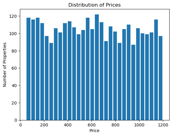
In this example, We plot a histogram of the price column using the plot method of the DataFrame. The kind='hist' argument specifies that we want a histogram, rwidth=0.8 specifies the relative width of the bars, and bins=30 specifies that we want to divide our data into 30 bins.
This will give us a histogram where the x-axis represents different price ranges and the y-axis represents the number of properties in each price range.
NumPy is a library for the Python programming language, adding support for large, multi-dimensional arrays and matrices, along with a large collection of high-level mathematical functions to operate on these arrays.
Matplotlib’s plots are built on the concept of arrays. So, it’s natural that NumPy, being a powerful tool for array computations, works well with Matplotlib.
First, let’s assume we have a column in our dataset called construction_year which represents the year each property was built. We might be interested in visualizing the distribution of these years to understand when most of the properties were built.
import numpy as np
import pandas as pd
import matplotlib.pyplot as plt
from matplotlib.ticker import MaxNLocator

plt.axes().xaxis.set_major_locator(MaxNLocator(integer=True))

# Convert the 'construction_year' column to a NumPy array
construction_years = airbnb_df['construction_year'].values

# Remove NaN values
construction_years = construction_years[~np.isnan(construction_years)]

# Plot a histogram
plt.hist(construction_years, bins='auto')
plt.title('Distribution of Construction Years')
plt.xlabel('Year')
plt.ylabel('Number of Properties')
plt.show()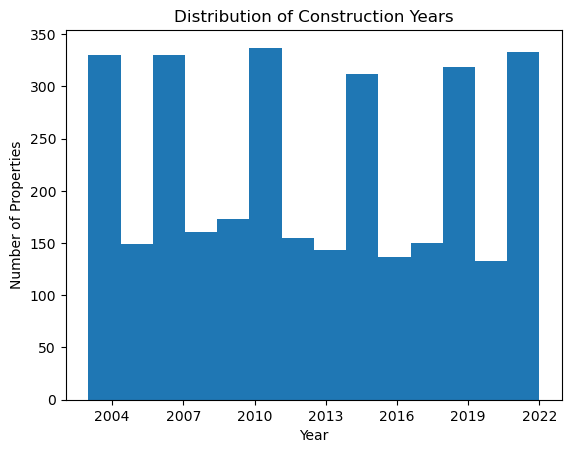
In this example, we’re first reading the Airbnb dataset into a Pandas DataFrame. We then convert the construction_year column to a NumPy array using the .values attribute.
Next, we use NumPy’s isnan function to create a boolean mask of which values in our array are NaN (Not a Number), and then use the ~ operator to invert this mask. By indexing our array with this mask, we remove all NaN values.
Finally, we plot a histogram of the construction years using Matplotlib’s hist function. The bins='auto' argument tells Matplotlib to automatically determine the best number of bins to use for our histogram.
Matplotlib is a versatile library in Python for creating static, animated, and interactive visualizations. Let’s dive into some basic plotting techniques.
A line plot is often used to visualize a trend in data over intervals of time - a time series. Thus, the line plot is often used when the x-axis represents time.
For example, we may use a line plot to show the trend of the average price (price column) over the years (construction_year column).
plt.axes().xaxis.set_major_locator(MaxNLocator(integer=True))

# assuming df is your DataFrame and it has been imported properly
avg_prices_per_year = airbnb_df.groupby('construction_year')['price'].mean()
years = avg_prices_per_year.index
prices = avg_prices_per_year.values

plt.plot(years, prices)
plt.xlabel('Year')
plt.ylabel('Average Price')
plt.title('Average Price Over the Years')
plt.show()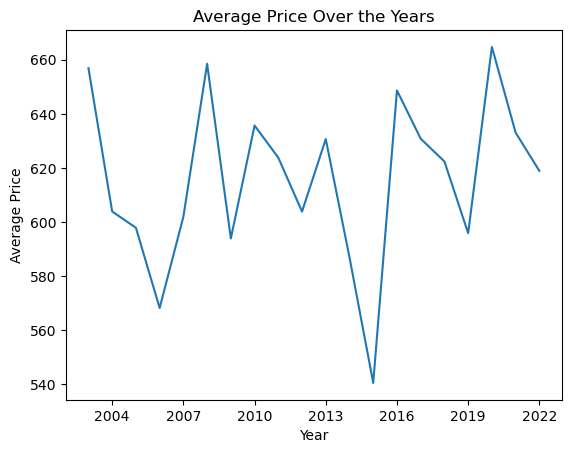
In that code, first we group the data by the construction year and calculate the average price in each grouped year. Next we get ready our x and y axis data points.
x values refer to the years, which is the index of our data.y values refer to the average prices, which are the values of our data.This line plot is showing us how the average price has changed over the years. The x-axis is the construction year and the y-axis the average price.
Points on the line connect the average price for each of the years, helping to visually demonstrate increases, decreases, or trends in the prices over time. This type of plot could help in understanding and predicting pricing trend, observing the price pattern based on the construction year, and so on.
A scatter plot uses dots to represent values for two different numeric variables. The position of each dot on the horizontal and vertical axis indicates values for an individual data point. A scatter plot is used when trying to understand the relationship or correlation between two numerical variables.
For example, Let’s say we are interested in seeing if there’s a correlation between the number_of_reviews and price. This would help us understand if the price influences the number of reviews a property receives.
reviews = airbnb_df['number_of_reviews'].values
prices = airbnb_df['price'].values

plt.scatter(reviews, prices)
plt.xlabel('Number Of Reviews')
plt.ylabel('Price')
plt.title('Price vs Number Of Reviews')
plt.show()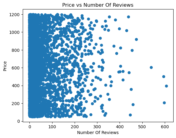
In that code, first we extract the number_of_reviews and price from each row in the DataFrame. Next we get ready our x and y axis data points.
x values refer to the reviews, which is the index of our data.y values refer to the average prices, which are the values of our data.By looking at the scatter plot, we can start to understand the relationship between these two variables.
Based on the scatter plot, it can be concluded that there is a weak or non-existent correlation because the dots are distributed randomly.
A bar chart or bar graph is a chart or graph that presents categorical data with rectangular bars with heights or lengths proportional to the values that they represent. Bar charts are great when you want to compare different categories of data. They are easy to read and can clearly display differences between categories.
There may be certain categories in our Airbnb data that we are particularly interested in. One such category could be room_type. Let’s say we want to compare the average price for each room_type.
avg_prices_per_room_type = airbnb_df.groupby('room_type')['price'].mean()
room_types = avg_prices_per_room_type.index
prices = avg_prices_per_room_type.values

plt.bar(room_types, prices)
plt.xlabel('Room Type')
plt.ylabel('Average Price')
plt.title('Average Price for Each Room Type')
plt.show()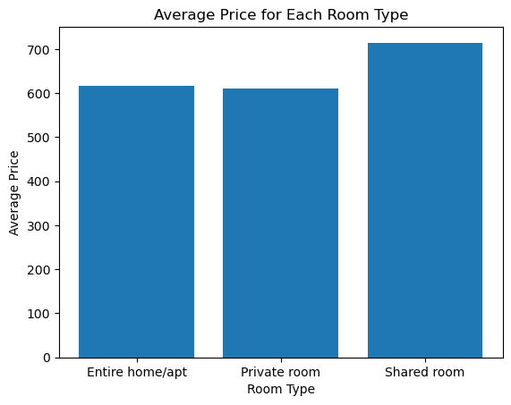
In that code, we calculate the average price for each room_type. Then extract the x and y values: - The x-values, or bar labels, are room types - The y-values, or bar heights, are the average prices
In the final bar chart, each bar represents a different room type, and the height of the bar represents the average price of listings in that category. By looking at the chart, we can easily compare average prices among room types.
Based on the above results we can conclude that the room type Shared room has a higher average list price than the others.
Pie charts are useful when you want to visualize proportions of a whole. Each segment of the pie represents a separate data entity and the size of a segment (slice) is proportional to the quantity it represents.
Consider we want to visualize the proportion of each room_type in our dataset.
room_type_counts = airbnb_df['room_type'].value_counts()
room_types = room_type_counts.index
counts = room_type_counts.values

plt.pie(counts, labels=room_types, autopct='%1.1f%%')
plt.title('Proportion of Each Room Type')
plt.show()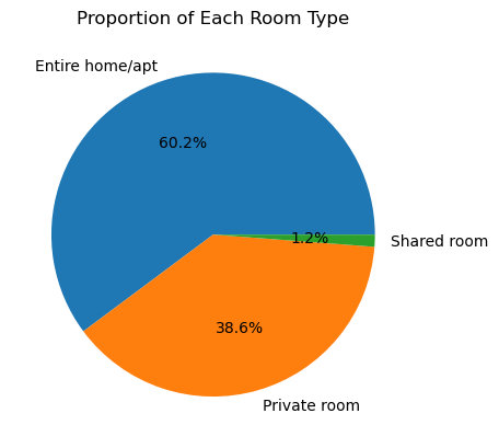
In that code, first we count the frequency of each unique room_type. Then extract the data - the segment labels are room types and segment sizes are the counts.
In the generated pie chart, each slice of the pie represents a different room type. The size of each slice is proportional to the count of listings in that category. The autopct parameter allows us to display the percentage value of each slice.
Looking at the pie chart, we can easily understand the distribution of room types in the dataset. As it is seen that the Entire home/apt room type is much bigger than the others, we understand that this room type occupies a larger portion of the market. Therefore, insights can be drawn as to which room type is most common or rarest.
Matplotlib provides several ways to customize the look of your plots. Different colors, markers and line styles can help make your plots more understandable and appealing.
Let’s assume we are going to create a line plot of the average price (price column) over the years (construction_year column) as before. Here is how you can customize your plot.
Color plays an important role in visualization. It helps to differentiate between different categories or data series, highlights essential parts of the plot, and also helps in setting the mood or context of the plot.
In Matplotlib, you can customize the color of almost any element of the chart (lines, bars, labels, backgrounds, etc.).
There are several ways in which you can specify color:
Common colors
Matplotlib supports common color names from the X11/CSS4 color spec. For example you can specify ‘blue’, ‘green’, ‘red’, ‘cyan’, ‘magenta’, ‘yellow’, ‘black’ (or ‘k’), ‘white’ (or ‘w’), and many more. py plt.plot([1, 2, 3, 4], [1, 4, 2, 3], color='green')
Hex color codes
You can specify colors using Hex color codes. py plt.plot([1, 2, 3, 4], [1, 4, 2, 3], color='#FFDD44') # gold color
RGB tuples
You can also specify colors via RGB (Red/Green/Blue) tuples. Each value in tuple is the RGB value ranging from 0 (none of that color) to 1 (full intensity), py plt.plot([1, 2, 3, 4], [1, 4, 2, 3], color=(0.1, 0.2, 0.5)) # RGB tuple
Grayscale
A single float in the 0-1 range creates a grayscale color. py plt.plot([1, 2, 3, 4], [1, 4, 2, 3], color='0.75') # a light shade of gray
Markers are used in Matplotlib charts to indicate individual data points or values, particularly in line charts, scatter plots, and similar plotted charts.
The marker style can be customized using the marker parameter in the plotting function. This helps differentiate between different data points in the plot, indicating the presence of a data point at an intersection of the x and y values.
Here are several examples of how to use the marker parameter in a plot:
Point Markers
The simplest case of a marker is a single point for each data point. You can specify this with the ‘o’ marker style. py plt.plot([1, 2, 3, 4], [1, 4, 2, 3], marker='o')
Plus Markers
You can use a plus sign for each data point. You can specify this with the ‘+’ marker style. py plt.plot([1, 2, 3, 4], [1, 4, 2, 3], marker='+')
Cross Markers
You can use a ‘x’ for each data point. You can specify this with the ‘x’ marker style. py plt.plot([1, 2, 3, 4], [1, 4, 2, 3], marker='x')
Square Markers
You can use a square block for each data point. You can specify this with the ‘s’ marker style. py plt.plot([1, 2, 3, 4], [1, 4, 2, 3], marker='s')
Diamond Markers
You can use a diamond shape for each data point. You can specify this with the ‘D’ marker style.
Line styles are used in Matplotlib to modify the appearance of lines in the plots. This comes in handy when you want to distinguish between different lines in a multi-line plot or when you want to adjust the aesthetic aspect of a single line plot.
The linestyle parameter in the plotting function is used to customize the style of the line.
Here are a few examples of common line styles:
Solid Lines
Solid lines are the default style for lines in matplotlib. You can explicitly specify a solid line with the ‘-’ style. py plt.plot([1, 2, 3, 4], [1, 4, 2, 3], linestyle='-')
Dashed Lines
Dashed lines can be created using the ‘–’ line style. py plt.plot([1, 2, 3, 4], [1, 4, 2, 3], linestyle='--')
Dotted Lines
Dotted lines can be created using the ‘:’ line style. py plt.plot([1, 2, 3, 4], [1, 4, 2, 3], linestyle=':')
Dash-dot Lines
Dash-dot lines use the ‘-.’ style, which is a line with alternating dashes and dots. py plt.plot([1, 2, 3, 4], [1, 4, 2, 3], linestyle='-.') You can also combine the use of line styles with other parameters to have more control over the appearance of the plot. For example, you can combine it with the linewidth parameter to adjust the thickness of the line: py plt.plot([1, 2, 3, 4], [1, 4, 2, 3], linestyle='-.', linewidth=2)
You can combine color, marker and linestyle settings in your line plot. For example, to have a red dashed line plot with circular markers, you can write:
plt.axes().xaxis.set_major_locator(MaxNLocator(integer=True))

avg_prices_per_year = airbnb_df.groupby('construction_year')['price'].mean()

plt.plot(avg_prices_per_year, color='red', marker='o', linestyle='--')
plt.xlabel('Year')
plt.ylabel('Average Price')
plt.title('Average Price Over the Years')
plt.show()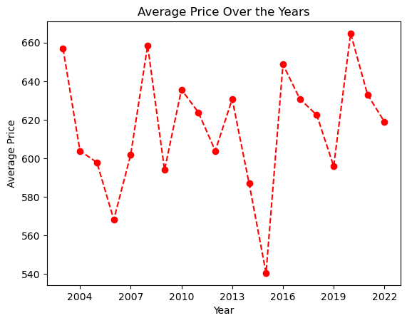
Adding informative titles, labels, and legends to your Matplotlib charts is crucial to help them convey their intended insights more effectively.
Titles give an overview of what the plot is about. You add them using the title() function.
For example, to add a title to a line plot for average price over years:
Labels for x and y axes describe the variables that you’re plotting. You add them using the xlabel() and ylabel() functions.
For example, adding labels to the above plot:
Legends are used to explain what the different lines or bars in your graph are, especially when you have multiple plots on the same axes. You can create a legend for your plot using the legend() function.
Here’s an example where we plot two lines — average price and median price over years. In this plot, the label parameter in the plot() function is used to set the text for the legend. Then by calling plt.legend(), a legend is drawn on the plot.
plt.axes().xaxis.set_major_locator(MaxNLocator(integer=True))

avg_prices_per_year = airbnb_df.groupby('construction_year')['price'].mean()
median_prices_per_year = airbnb_df.groupby('construction_year')['price'].median()

plt.plot(avg_prices_per_year, label='Average Price')
plt.plot(median_prices_per_year, label='Median Price')
plt.title('Price Over Years')
plt.xlabel('Year')
plt.ylabel('Price')
plt.legend()
plt.show()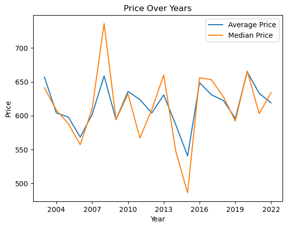
Matplotlib provides the functionality to save the created plots or figures to image files which can be used later for various purposes including reports, presentations, or web content.
The savefig() function is used to save the current figure to a file. This function must be called before plt.show(), as the latter closes the figure window and discards its content.
Here’s an example where we plot the average price over the years and then save the plot to a .png file:
plt.axes().xaxis.set_major_locator(MaxNLocator(integer=True))

# Calculate average prices per year
avg_prices_per_year = airbnb_df.groupby('construction_year')['price'].mean()

# Create plot
plt.plot(avg_prices_per_year)
plt.title('Average Price Over Years')
plt.xlabel('Year')
plt.ylabel('Average Price')

# Save plot to a file before showing it
plt.savefig('average_price_over_years.png')

# Now display the figure
plt.show()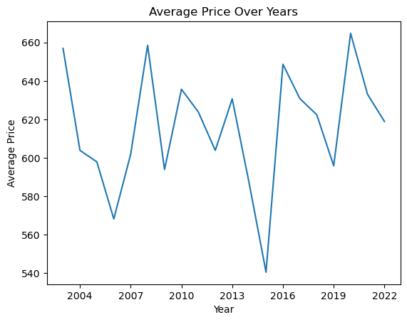
In this example, plt.savefig('average_price_over_years.png') saves the figure to a .png file in the current working directory with the name ‘average_price_over_years.png’.
Some important parameters of savefig() are:
dpi (dots per inches): This controls the quality (resolution) of the saved image. For example, plt.savefig('plot.png', dpi=300).
bbox_inches: This controls what part of the figure is saved. If you want to make sure your labels don’t get cut off, you can use bbox_inches='tight'.
Saving your figures allows you to share your visualizations easily with others, or incorporate these visualizations into presentations or documents. It’s a crucial aspect for preserving your insights for later use.
Visualizing multivariate data involves creating graphical representations of data with more than two variables. It is a crucial aspect of data analysis and machine learning, as it allows for a better understanding of the patterns, relationships, and structures within the data.
A Pair Plot is a compact way of visualizing the relationships between different pairs of variables in a multi-dimensional dataset. It’s a grid of scatter plots where each plot on the diagonal shows the distribution of a single variable while plots off the diagonal display the relationship (or lack thereof) between two variables.
Here’s a more detailed breakdown:
Diagonal Plots: The plots on the diagonal of the Pair Plot matrix are usually univariate plots. For numerical data, these are typically histograms or kernel density plots. These plots are useful for seeing the distribution of a single variable.
Off-Diagonal Plots: The plots off the diagonal are bivariate plots where each plot shows the relationship between two variables. These are typically scatter plots. They are useful for seeing the relationships between variables. For example, you might see a positive trend between two variables, indicating they increase together, or a negative trend, indicating that as one variable increases, the other decreases.
Correlation: Pair Plots can be a quick way to see the correlation between variables. If there’s a strong positive or negative correlation between two variables, you’ll see a scatter plot that trends up or down. If there’s no correlation, the scatter plot will look random.
Outliers: Pair Plots can also help identify outliers. If there are points that don’t fit the general trend in the scatter plot, these could be outliers.
Variable Relationships: Pair Plots can help identify types of relationships between variables, whether they are linear or non-linear.
In Python, Pair Plots can be easily created using the seaborn library’s pairplot function. This function takes a DataFrame and returns a Pair Plot grid. You can customize the types of plots on and off the diagonal and color points by category.
import seaborn as sns
import matplotlib.pyplot as plt
import numpy as np

# Select specific columns
selected_columns = ['price', 'minimum_nights', 'number_of_reviews']

# Create a pair plot
sns.pairplot(airbnb_df[selected_columns])

# Show the plot
plt.show()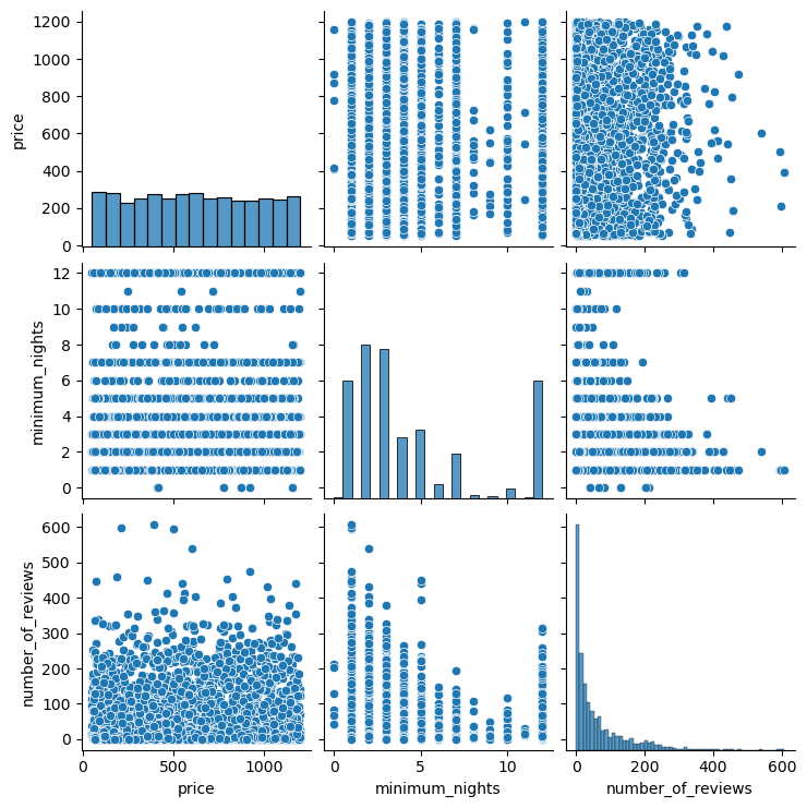
This will create a Pair Plot for the selected columns in the DataFrame. Each cell in the grid represents a pair of variables, and each point in the scatter plots represents a row in the DataFrame.
The diagonal plots are histograms that show the distribution of each variable. You can see the range of values and how they are distributed.
The off-diagonal plots are scatter plots that show the relationship between pairs of variables. You can see if there’s a positive or negative correlation between the variables, or if there’s no clear correlation.
A heatmap is a graphical representation of data where individual values contained in a matrix are represented as colors. It’s a way of visualizing a numeric table with colors, which can make it easier to understand complex data sets by visualizing trends, variances, and patterns.
Heatmaps are particularly useful when you want to understand the landscape of a multivariate dataset - both the range of values in each variable and the relationships between different pairs of variables.
A correlation matrix is a specific type of heatmap that shows the correlation coefficients between sets of variables. Each row and column represents a different variable, and each cell in the matrix shows the correlation between two variables.
The correlation coefficient is a statistical measure that calculates the strength of the relationship between the relative movements of two variables. The range of values for the correlation coefficient is -1.0 to 1.0.
In Python, you can use the Pandas library’s corr function to compute the correlation matrix of a DataFrame, and then use the seaborn library’s heatmap function to visualize the correlation matrix.
# Compute the correlation matrix
corr = airbnb_df.corr(numeric_only=True)

# Generate a mask for the upper triangle
mask = np.ones_like(corr, dtype=np.bool_)
mask[np.triu_indices_from(mask)] = False

# Set up the matplotlib figure
f, ax = plt.subplots(figsize=(11, 9))

# Generate a custom diverging colormap
cmap = sns.diverging_palette(230, 20, as_cmap=True)

# Draw the heatmap with the mask and correct aspect ratio
sns.heatmap(corr, mask=mask, cmap=cmap, vmax=.3, center=0,
            square=True, linewidths=.5, cbar_kws={"shrink": .5})

plt.show()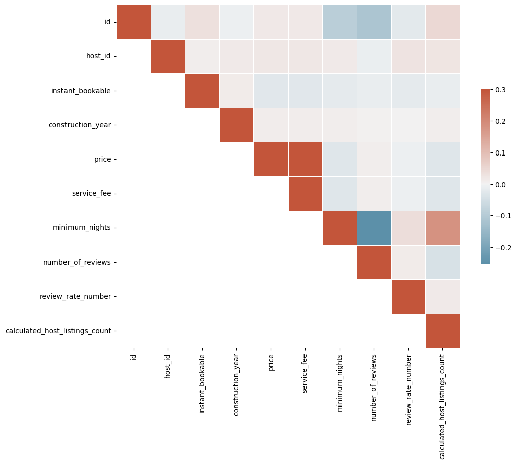
In this heatmap, darker colors represent higher correlation coefficients. You can quickly see which pairs of variables are most strongly correlated.
For example, you might find that the minimum night is strongly positively correlated with the number of listings a host has, indicating that hosts who require a higher minimum number of nights for their listings also tend to have a higher number of listings.
Parallel Coordinate Plots (PCPs) are a common way of visualizing and analyzing high-dimensional datasets. High dimensional means that the data has many attributes or variables, which can be hard to visualize in traditional scatter plots.
In a Parallel Coordinate Plot, each variable in the dataset is given its own axis and all the axes are placed in parallel to each other. Each data instance is represented as a line that crosses all the axes. The position where the line intersects each axis corresponds to the value of the instance in that particular variable.
Here’s a more detailed breakdown:
Axes: Each variable in your dataset gets its own axis. The axes are placed parallel to each other, usually in the order the variables appear in your dataset.
Lines: Each data instance (or row in your dataset) is represented as a line that crosses all the axes. The point where a line intersects an axis corresponds to the value of that instance for the variable represented by the axis.
Interpretation: Lines that are close together for several axes indicate instances that have similar values for those variables. Clusters of lines can indicate groups of similar instances, and crossing lines can indicate inverse correlations between variables.
Parallel Coordinate Plots are particularly useful when you want to visualize high-dimensional data and understand the relationships between different variables. They can help you identify trends, correlations, and patterns in your data, and they can also help you detect outliers.
In Python, you can use the Pandas library’s plotting.parallel_coordinates function to create Parallel Coordinate Plots.
from pandas.plotting import parallel_coordinates
import matplotlib.pyplot as plt

# Select a subset of the data
subset = airbnb_df[['room_type', 'minimum_nights', 'number_of_reviews', 'calculated_host_listings_count']].copy()

# Normalize the numerical columns so they're on the same scale
cols_to_normalize = ['minimum_nights', 'number_of_reviews', 'calculated_host_listings_count']
subset[cols_to_normalize] = (subset[cols_to_normalize] - subset[cols_to_normalize].min()) / (subset[cols_to_normalize].max() - subset[cols_to_normalize].min())

# Create the plot
parallel_coordinates(subset, 'room_type', colormap=plt.get_cmap("Set2"))

# Show the plot
plt.show()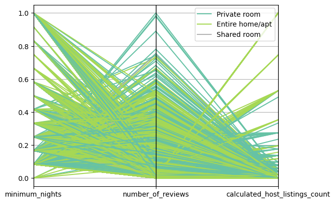
In this plot, each line represents a listing. The color of the line corresponds to the room_type. The position where a line intersects an axis corresponds to the value of that listing for the variable represented by the axis.
You might see that listings of a certain room type tend to require longer minimum stays, have more reviews, or have a higher calculated host listings count. This can give you insights into the characteristics of different types of listings.
A radial chart, also known as a circular chart or a pie chart, represents data in a circular format. The circular representation is often used when we want to show a dataset as a proportion of a whole, where each slice of the pie represents a particular category.
Radar plots, also known as spider charts, web charts, or star plots, are a multivariate data display on a two-dimensional plot in a circular format. They are particularly useful when you want to visualize performance, measure the similarity between different entities, or visualize multivariate data.
In a radar plot, each variable is given a separate axis that starts from the center of the circle and ends on the outer ring. All the axes are arranged radially around the center with equal distances between them. Each data point is plotted along its individual axis and a line is drawn connecting all the data points to form a polygon.
Here’s a more detailed breakdown:
Axes: Each variable in your dataset gets its own axis. The axes are arranged radially around a central point and are equally spaced.
Lines: Each data instance (or row in your dataset) is represented as a line that connects the data points on the axes. The point where a line intersects an axis corresponds to the value of that instance for the variable represented by the axis.
Polygons: The lines connecting the data points form a polygon. The shape of the polygon gives an idea of the pattern of the multivariate data.
Interpretation: The closer the data points are to the outer edge of the circle, the higher the observed values. If the polygon is large and covers a large portion of the circle, that indicates high values for most or all variables. If the polygon is small and close to the center of the circle, that indicates low values.
import matplotlib.pyplot as plt
import pandas as pd
from math import pi

# Select a subset of the data
subset = airbnb_df[['price', 'minimum_nights', 'number_of_reviews', 'calculated_host_listings_count']].iloc[0]

# Number of variables
num_vars = len(subset)

# Compute angle each axis will be on
angles = [n / float(num_vars) * 2 * pi for n in range(num_vars)]
angles += angles[:1]

# Initialise the spider plot
ax = plt.subplot(111, polar=True)

# Draw one axe per variable + add labels
plt.xticks(angles[:-1], subset.keys(), color='grey', size=8)

# Draw ylabels
ax.set_rlabel_position(0)
plt.yticks([10,20,30], ["10","20","30"], color="grey", size=7)
plt.ylim(0,40)

# Plot data
values = subset.tolist()
values += values[:1]
ax.plot(angles, values, linewidth=1, linestyle='solid')

# Fill area
ax.fill(angles, values, 'b', alpha=0.1)

plt.show()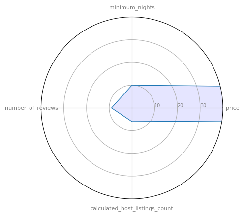
In this plot, each axis represents a variable, and the polygon represents the values of a single listing. The closer a point is to the outer edge, the higher the value for that variable.
# @title #### 00. Neighbourhood Group Chart
from rggrader import submit
import pandas as pd
import matplotlib.pyplot as plt

# Use the following Airbnb data to display the distribution of various neighbourhood group in Airbnb listings.
# https://storage.googleapis.com/rg-ai-bootcamp/visualization/airbnb-data.csv

# TODO: Create a pie chart to visualize the distribution of these room types.
# Put your code here:
df = pd.read_csv('csv here')


# ---- End of your code ----

# Submit Method
assignment_id = "00_visualization"
question_id = "00_neighbourhood_group_chart"
submit(student_id, name, assignment_id, neighbourhood_group_counts.to_string(), question_id)

# Expected Output:
# Pie chart of distribution of room types with the following
# Manhattan 46.6%
# Brooklyn 44.6%
# Queens 7.0%
# Bronx 1.1%
# Staten Island 0.7%
# @title #### 01. Top 10 Neighbourhood with the most listings Chart
from rggrader import submit
import pandas as pd
import matplotlib.pyplot as plt
# Use the following Airbnb data to display the top 10 neighourhood with the most listings
# https://storage.googleapis.com/rg-ai-bootcamp/visualization/airbnb-data.csv
# TODO: Create a bar chart to visualize the top 10 neighbourhood with the most listings
# Put your code here:
df = pd.read_csv('csv here')
# Get top 10 neighborhoods with the most listings
top_neighbourhoods = none
# ---- End of your code ----
# Submit Method
assignment_id = "00_visualization"
question_id = "01_top_10_neighbourhood_chart"
submit(student_id, name, assignment_id, top_neighbourhoods.to_string(), question_id)
# Expected Output:
# Barchart with the following neighbourhood
# Williamsburg, Bedford-Stuyvesant, Harlem, East Village, Upper West Side, Crown Heights, Greenpoint, Upper East Side, Bushwick, Chelsea