import numpy as np
import matplotlib.pyplot as plt

# Create data
x = np.arange(0, 5, 0.1)
y = x

# Plot
plt.plot(x, y)
plt.xlim(0, 5)
plt.ylim(0, 5)

# Set the x and y labels
plt.xlabel('x')
plt.ylabel('y')

plt.title('y = x')

plt.show()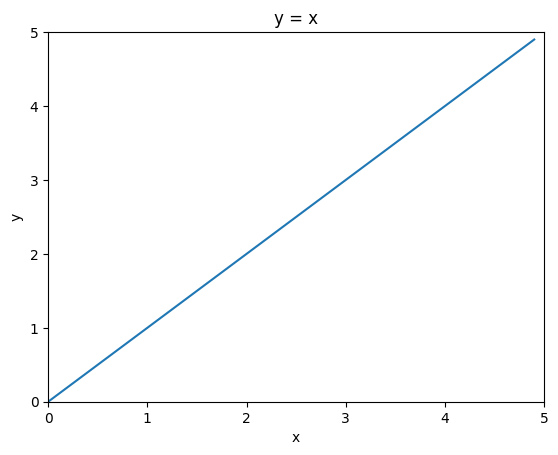
Remember that machine learning is about learning some form of input-output mapping, and then using that model to make predictions on new data.
We will learn how to do this using linear regression, which is a simple yet powerful technique.
But… Let’s revisit high school math for a moment.
Let’s say we have a linear equation:
y = xHow the curve looks like?
import numpy as np
import matplotlib.pyplot as plt
# Create data
x = np.arange(0, 5, 0.1)
y = x
# Plot
plt.plot(x, y)
plt.xlim(0, 5)
plt.ylim(0, 5)
# Set the x and y labels
plt.xlabel('x')
plt.ylabel('y')
plt.title('y = x')
plt.show()
How about this one?
y = 2xHow 2 changes the curve?
# Draw y = 2x

import numpy as np
import matplotlib.pyplot as plt

# Create data
x = np.arange(0, 5, 0.1)
y = 2* x

# Plot
plt.plot(x, y)
plt.xlim(0, 5)
plt.ylim(0, 5)

# Set the x and y labels
plt.xlabel('x')
plt.ylabel('y')

plt.title("y = 2x")

plt.show()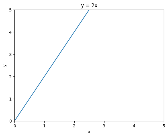
Notice the difference?
The slope is steeper.
How about y = 0.5x?
# Draw y = 0.5x
import numpy as np
import matplotlib.pyplot as plt

# Create data
x = np.arange(0, 5, 0.1)
y = 0.5*x

# Plot
plt.plot(x, y)
plt.xlim(0, 5)
plt.ylim(0, 5)

# Set the x and y labels
plt.xlabel('x')
plt.ylabel('y')

plt.title("y = 0.5x")

plt.show()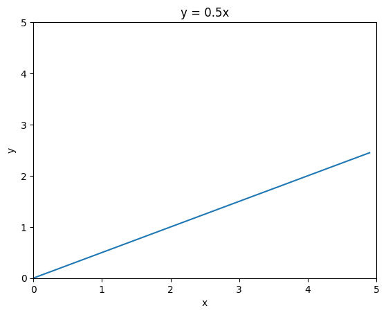
Now, how about this one?
y = 2x + 1How +1 changes the curve?
# Draw y = 2x + 1

import numpy as np
import matplotlib.pyplot as plt

# Create data
x = np.arange(0, 5, 0.1)
y = 2*x + 1

# Plot
plt.plot(x, y)
plt.xlim(0, 5)
plt.ylim(0, 5)

# Set the x and y labels
plt.xlabel('x')
plt.ylabel('y')

plt.title("y = 2x + 1")

plt.show()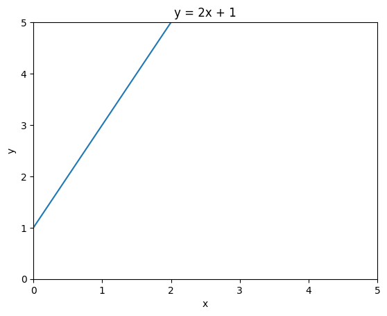
The line intersect with the y-axis at 1, and the slope of the line is 2.
The previous equations are all linear equations. Linear equations can be represented as:
y = ax + b
where a is the slope of the line and b is the y-intercept.
import numpy as np
import matplotlib.pyplot as plt
import ipywidgets as widgets

def draw(a, b):
    # Draw y = ax + b

    # Create data
    x = np.arange(0, 5, 0.1)
    y = a*x + b

    # Plot
    plt.plot(x, y)
    plt.xlim(0, 5)
    plt.ylim(0, 5)

    # Set the x and y labels
    plt.xlabel('x')
    plt.ylabel('y')

    plt.title("y = ax + b")

    plt.show()

a_slider = widgets.FloatSlider(min=0, max=10, step=0.1, value=2, description='a:')
b_slider = widgets.FloatSlider(min=0, max=10, step=0.1, value=3, description='b:')

# Display the widgets and plot
widgets.interactive(draw, a=a_slider, b=b_slider)3D linear equation can be represented as:
z = ax + by + c
where a is the slope of the line on the x-axis, b is the slope of the line on the y-axis, and c is the z-intercept.
It can also be seen as an equation with two variables x and y:
import numpy as np
import matplotlib.pyplot as plt
import ipywidgets as widgets

def draw(a, b, c):
    # Draw z = ax + by + c

    # Create data
    x = np.arange(0, 50, 1)
    y = np.arange(0, 50, 1)
    X, Y = np.meshgrid(x, y)
    Z = a*X + b*Y + c

    # Plot 3D
    fig = plt.figure()
    ax = fig.add_subplot(111, projection='3d')
    ax.plot_surface(X, Y, Z)

    # Fix the projection from X = [0, 5] and Y = [0, 5] and Z = [0, 5]
    ax.set_xlim(0, 50)
    ax.set_ylim(0, 50)
    ax.set_zlim(0, 50)

    # Set the x and y labels
    plt.xlabel('x')
    plt.ylabel('y')

    plt.title("z = ax + by + c")

    plt.show()

a_slider = widgets.FloatSlider(min=-5, max=5, step=0.1, value=0, description='a:')
b_slider = widgets.FloatSlider(min=-5, max=5, step=0.1, value=0, description='b:')
c_slider = widgets.FloatSlider(min=-50, max=50, step=0.1, value=0, description='c:')

# Display the widgets and plot
widgets.interactive(draw, a=a_slider, b=b_slider, c=c_slider)Now, let say we have the following data:
import numpy as np
import matplotlib.pyplot as plt

# Create scattered dot around y = 3x + 8
x_data = np.random.rand(100) * 10
noise = np.random.normal(0, 2, x_data.shape)
y_data = 3*x_data + 8 + noise

# Plot
plt.scatter(x_data, y_data, s=1)

# Set the x and y labels
plt.xlabel('x')
plt.ylabel('y')

plt.show()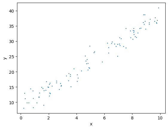
The data can about anything, for example, the number of hours spent studying (x) and the grade you get in the exam (y).
It can be obtained by asking your friends, or by doing a survey.
Give that experiment data, can we predict the grade of a student if we know how many hours he/she spent studying?
How?
One way to do this is to fit a line into the data.
How do we do that?
import numpy as np
import matplotlib.pyplot as plt

# Create scattered dot around y = 3x + 8
x_data = np.random.rand(100) * 10
noise = np.random.normal(0, 2, x_data.shape)
y_data = 3*x_data + 8 + noise

# Plot
plt.scatter(x_data, y_data, s=1)

# Plot y = 3x + 8
x = np.arange(0, 10, 0.1)

a = 3
b = 8
y = a*x + b
plt.plot(x, y, color='red')

# Set the x and y labels
plt.xlabel('time spent on studying')
plt.ylabel('grade')

plt.show()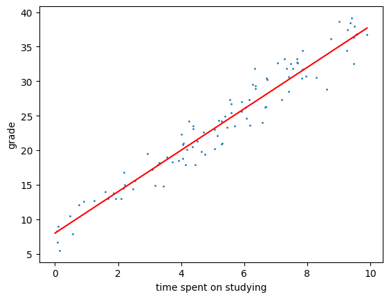
Let’s try manual approach first, i.e. we try different values of m and b until we get a good fit.
Remember, the equation is y = mx + b.
import numpy as np
import matplotlib.pyplot as plt
import ipywidgets as widgets
from IPython.display import display


x_data = np.random.rand(100) * 10
noise = np.random.normal(0, 2, x_data.shape)
y_data = 3*x_data + 8 + noise

# Define the update function
def draw(a, b):
    x = np.arange(0, 10, 0.1)
    y = a*x + b

    plt.plot(x, y, color='red')
    plt.scatter(x_data, y_data, s=1)
    plt.xlabel('x')
    plt.ylabel('y')

    plt.title(f"Equation y = {a}x + {b}")
    plt.show()

# Create scattered dot around y = 3x + 8
x = np.random.rand(100) * 10
noise = np.random.normal(0, 2, x.shape)
y = 3*x + 8 + noise

# Define the slider widgets
a_slider = widgets.FloatSlider(min=0, max=10, step=0.1, value=0, description='a:')
b_slider = widgets.FloatSlider(min=0, max=10, step=0.1, value=0, description='b:')

# Display the widgets and plot
widgets.interactive(draw, a=a_slider, b=b_slider)
Given that equation, what would be the grade if the student spent 1 hour studying?