import numpy as np

# Input is a single number
print(np.exp(1))
print(np.exp(2))

# Input is an array
print(np.exp(np.array([1,2,3])))
2.718281828459045
7.38905609893065
[ 2.71828183 7.3890561 20.08553692]Having explored how linear regression can help us predict house prices, let’s shift our attention to another powerful technique in the field of supervised learning: classification. While regression is best used for predicting continuous values like house prices, classification comes into its own when we need to sort data into specific categories.
Classification is a type of supervised learning where the output is a categorical variable. This means that the algorithm is trained on a labeled dataset, and it uses this training to categorize new, unseen data into specific classes. The output, or label, is a category, such as “spam” or “not spam” for an email classification system, or “malignant” or “benign” for a tumor classification system.

By convention, we can refer to these two classes or categories in several general ways. We often define clauses as no or yes or sometimes as equivalent to False or True or very commonly use the numbers 0 or 1. One technology commonly used is to call The False or 0 class, The negative class and The True class or 1 class, The positive class.
| False | True |
|---|---|
| No | Yes |
| 0 | 1 |
| Negative class | Positive class |
There are two main types of classification problems:
Binary Classification: In binary classification, there are only two possible categories. The tumors classification example mentioned above is a binary classification problem, where the two categories are “malignant” and “benign”.
Multiclass Classification: In multiclass classification, there are more than two categories. For example, a model that classifies news articles into categories like “sports”, “politics”, “technology”, and “entertainment” would be a multiclass classification problem.
Let’s take a closer look at the tumor classification example to understand how classification works.
Imagine you’re a doctor who specializes in diagnosing tumors. Over the years, you’ve seen thousands of patients and have developed an intuition for diagnosing whether a tumor is malignant (cancerous) or benign (not cancerous) based on certain features such as the size of the tumor, its shape, and the rate at which it’s growing.
Now, suppose you want to train a machine learning model to do this task. You would start by collecting a dataset of tumors for which you already know the diagnosis. Each tumor in this dataset is labeled either “malignant” or “benign” - these are your classes. The features of each tumor, such as its size, shape, and growth rate, are your input variables.
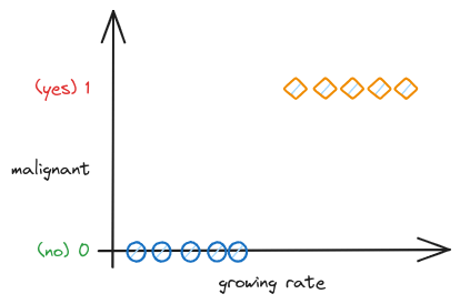
You feed this labeled dataset into your classification algorithm, which learns a function that maps the input variables (the features of the tumor) to the output variable (the class label). This function is essentially a decision boundary that separates the different classes based on the input variables.
Once the model is trained, you can use it to classify new, unseen tumors. You input the features of the new tumor into the model, and it outputs a class label - either “malignant” or “benign”. The model has essentially learned to mimic your decision-making process based on the training you gave it.
There are many algorithms that can be used for classification tasks, each with its own strengths and weaknesses. Some of the most commonly used ones include:
Logistic Regression: Despite its name, logistic regression is used for classification tasks. It uses the logistic function to transform its output into a probability that can be used to predict a class label.
Decision Trees: These are simple yet powerful algorithms that split the feature space into regions. For any new instance, the algorithm checks which region it belongs to and assigns the class label accordingly.
Random Forests: This is a type of ensemble method that combines multiple decision trees to make a more accurate prediction.
Support Vector Machines (SVMs): SVMs try to find a hyperplane that best separates the classes in the feature space.
Neural Networks: These are powerful and flexible algorithms that can learn complex patterns. They are particularly useful when dealing with high-dimensional data, such as images.
Before we go deeper, let’s learn a bit of Math first.
Euler’s number, often denoted as e, is a special mathematical constant that is approximately equal to 2.71828. It’s named after the Swiss mathematician Leonhard Euler. Euler’s number is the base of natural logarithms and has several unique properties that make it fundamental in mathematics, especially in calculus.
But where does Euler’s number come from? Euler’s number arises naturally when dealing with growth phenomena. Let’s use a simple compound interest analogy:
Suppose you have $1 and you’re getting 100% interest per year.
If the interest is compounded annually (i.e., at the end of the year), after one year you’ll have $2.
If the interest is compounded semi-annually (twice a year), you would get more than $2. Specifically, you would get sqrt(2)^2 = 2.25.
As we increase the frequency of compounding, the total amount after 1 year increases.
$2.4414.$2.6130.$2.7146.As we continue compounding more frequently (every minute, every second, and so on), the limit we reach as the compounding gets infinitely frequent is precisely Euler’s number e dollars or around $2.71828.
Compounded per year n |
Total Amount after 1 year |
|---|---|
| 1 (annually) | 2 |
| 2 (semi-annually) | 2.25 |
| 4 (quarterly) | 2.4414 |
| 12 (monthly) | 2.6130 |
| 365 (daily) | 2.7146 |
| 1,000 | 2.7169 |
| 10,000 | 2.7181 |
| 100,000 | 2.7182 |
| 1,000,000 | 2.71828 |
| ∞ (continuously) | e ≈ 2.71828 |
You can also try using different interest rates in here: Eulers number
As n becomes very large, this expression approaches e. The mathematical formula is:
\[e = (1 + \frac{1}{n})^n\]
If a quantity grows at a rate proportional to its current size—a property known as “exponential growth”—then that growth is often described naturally using e.
Here are a few other examples:
In population biology, if a population of organisms grows without bounds (i.e., has unlimited resources and no competition or predation), the population will grow exponentially over time. This growth can be modeled using e.
In physics, certain quantities decay exponentially, like radioactive substances or the damping of a pendulum. The decay is often modeled using e.
So, while e is often associated with growth, it’s specifically constant proportional growth (or decay)—in other words, situations where the rate of change of a quantity is proportional to the quantity itself. It helps us model and understand phenomena where things grow proportionally to their current amount, a kind of growth that’s common in nature and financial systems.
In NumPy, you can use Euler’s number with the exp() function. Here’s how you can get the value of e:
Here is an example of how Euler's Number is used in Numpy with the exp() function:
import numpy as np
# Input is a single number
print(np.exp(1))
print(np.exp(2))
# Input is an array
print(np.exp(np.array([1,2,3])))2.718281828459045
7.38905609893065
[ 2.71828183 7.3890561 20.08553692]We won’t go too deep into Euler’s number or e, we’ll focus more on the practical use, for now we’ll use e as a constant in our machine learning calculation.
Now, we’ll take a look at Sigmoid function. Let’s see what the it looks like:
import numpy as np
import matplotlib.pyplot as plt

# Create a sigmoid function
def sigmoid(x):
    return 1 / (1 + np.exp(-x))

# Generate x values
x = np.linspace(-10, 10, 100)

# Compute sigmoid(x)
y = sigmoid(x)

# Create the plot
plt.figure(figsize=(9, 6))
plt.plot(x, y, label="sigmoid function")
plt.title('Sigmoid Function')
plt.legend(loc='best')
plt.show()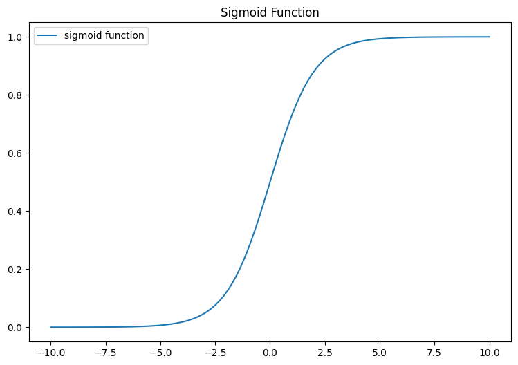
The mathematical formula for a Sigmoid function is as follows:
\[g(z) = \frac{1}{1+e^{-z}}\]
The sigmoid function is implemented in python as shown in the cell below.
Let’s examine the results this function generates for different z values.
import numpy as np
import matplotlib.pyplot as plt

z_tmp = np.arange(-5,5)
y = sigmoid(z_tmp)
np.set_printoptions(precision=3)
print("Input (z), Output (sigmoid(z))")
print(np.c_[z_tmp, y])
Input (z), Output (sigmoid(z))
[[-5. 0.007]
[-4. 0.018]
[-3. 0.047]
[-2. 0.119]
[-1. 0.269]
[ 0. 0.5 ]
[ 1. 0.731]
[ 2. 0.881]
[ 3. 0.953]
[ 4. 0.982]]The left column represents z, while the right column signifies sigmoid(z). It’s clear to see that the input values for the sigmoid fall between -5 and 5, and the resulting outputs are dispersed from 0 to 1. The value will never touch 0 and 1 but will be very close to 0 and 1.
Now, let’s attempt to visualize this function through the use of the matplotlib library.
#in local environment you may need to install ipywidgets first

import numpy as np
import matplotlib.pyplot as plt
from ipywidgets import interact

def plot_func(left=-5, right=5):
    z_tmp = np.arange(left,right)
    y = sigmoid(z_tmp)

    plt.figure(figsize=(5, 3))
    plt.plot(z_tmp, y, c="b")
    plt.title('Sigmoid Function')
    plt.ylabel('sigmoid(z)')
    plt.xlabel('z')
    plt.show()

interact(plot_func, left=(-10.0, 10.0), right=(-10.0, 10.0))
<function __main__.plot_func(left=-5, right=5)>What you can observe here is the behavior of the sigmoid function: - Tends towards 0 when z is a significantly negative value - Gradually ascends towards 1 when z becomes a large positive value.
Note: Try changing the number -5,5 in the line above
z_tmp = np.arange(-5,5)to other numbers and notice the shape of the function.
In summary, the Sigmoid function will map any numeric ranges including big ranges -Infinity to Infinity values to 0 and 1.
Now, let’s see what we learn Sigmoid function for.
Logistic Regression is a classification algorithm used when the response variable is categorical. For instance, it can be used for cancer detection problems (like our tumor example) where the task is to predict a category - malignant or benign. To build out to the logistic regression algorithm, we’ll use The Sigmoid function.
The Sigmoid function is a fundamental part of logistic regression. It maps any real-valued number into the range [0, 1], which can be interpreted as a probability for binary classification.
Let’s start with what we know, previously we use linear equation to help us find a model that fits our data. Which is a straight line, then we fine tune the line using parameter w and b.
import numpy as np
import matplotlib.pyplot as plt

# Generate x values
x = np.linspace(-10, 10, 100)

# Define slope (m) and y-intercept (b)
w = 2
b = 1

# Compute y = wx + b
y = w*x + b

# Create the plot
plt.figure(figsize=(9, 6))
plt.plot(x, y, label="linear function")
plt.title('Linear Function')
plt.legend(loc='best')
plt.show()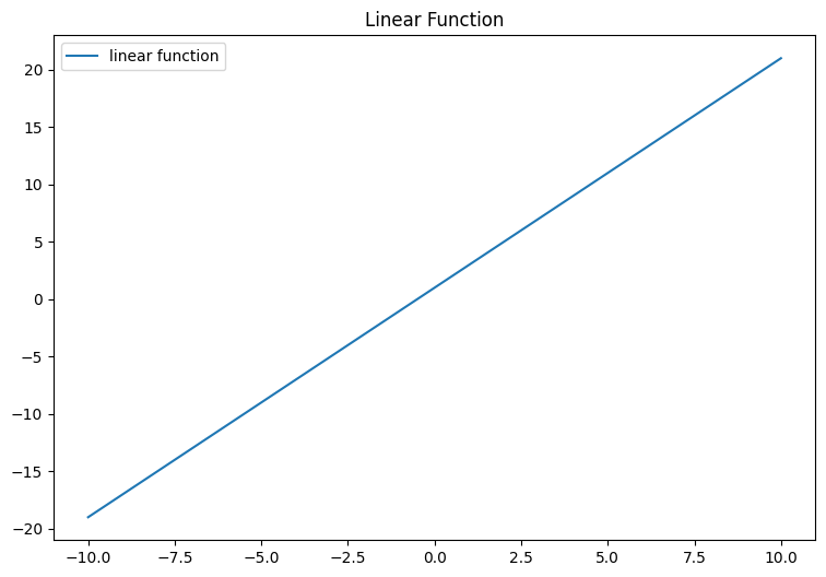
However in the case of our data, we need to find a model that is a better fit for our data. In the case of our tumor dataset, we need to map it to return only malignant or benign, or simply 1 or 0. Which is known as binary classification.
Scaling our data to fit the maximum of 1 and minimum of 0 is difficult, isn’t it ?
We can input our linear equation into the Sigmoid function which will then “flatten” the line to “S” like curve we see above.
If you recall the tumor graph above, the data is clustered around 0 and 1, so it’s kind of hard to plot a straight line through the data. The Sigmoid function by flattening the upper and bottom part around 0 and 1.
We can write our logistic regression model combining our linear equation with sigmoid function as shown below:
\[ f(\mathbf{x}_{(i)}) = g(\mathbf{w} \cdot \mathbf{x}_{(i)} + b )\]
where
\[g(z) = \frac{1}{1+e^{-z}}\]
and \(\mathbf{w} \cdot \mathbf{x}\) is the vector dot product:
\[\mathbf{w} \cdot \mathbf{x} = w_0 x_0 + w_1 x_1\]
After understanding the basics of logistic regression, let’s get back to our case example, tumour classification. We have two features for our logistic regression model: tumor size and patient age. Let’s call these features \(x_1\) to \(x_2\). Since this is a binary classification task, the target label \(y\) takes only two values, 0 or 1.
| Tumour Size (cm) (\(x_1\)) | Patient Age (\(x_2\)) | Malignant Status (\(y\)) |
|---|---|---|
| 7.1 | 55 | 1 |
| 3.2 | 30 | 0 |
| 5.8 | 65 | 1 |
| 2.0 | 20 | 0 |
| 8.4 | 72 | 1 |
| 4.2 | 40 | 0 |
| 7.6 | 60 | 1 |
| 2.5 | 25 | 0 |
| 6.8 | 70 | 1 |
| 1.7 | 22 | 0 |
| 7.5 | 68 | 1 |
| 3.1 | 35 | 0 |
| 8.2 | 66 | 1 |
| 2.2 | 28 | 0 |
For our lesson, we’ll focus on using only 1 feature, because it’s easier to visualize.
Let’s take a look at Tumour Size:
import numpy as np

#Given data
data = {
    'Tumour Size (cm)': [7.1, 3.2, 5.8, 2.0, 8.4, 4.2, 7.6, 2.5, 6.8, 1.7, 7.5, 3.1, 8.2, 2.2],
    'Patient Age': [55, 30, 65, 20, 72, 40, 60, 25, 70, 22, 68, 35, 66, 28],
    'Malignant Status': [1, 0, 1, 0, 1, 0, 1, 0, 1, 0, 1, 0, 1, 0]
}

# Create a dataframe
df = pd.DataFrame(data)

# Define your data
tumour_size = df['Tumour Size (cm)']
malignant_status = df['Malignant Status']

# Create scatter plot
plt.scatter(patient_age, malignant_status)
plt.xlabel('Tumour Size (cm)')
plt.ylabel('Malignant Status')
plt.title('Tumour Size vs Malignant Status')
plt.show()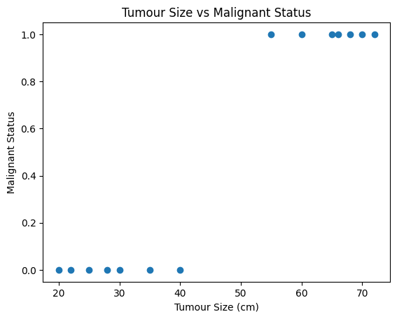
Now, let’s try using linear regression model to this data:
# Presumed values of w and b, replace with your own values
w = 0.6 #0.60562
b = -2.5 #-2.4966

# Create input range, using min and max of your data

y = w*x + b

# Create scatter plot
plt.scatter(tumour_size, malignant_status, color='blue')
plt.plot(x, y, '-r', label='y=wx+b')
plt.title('Fitting Linear Regression')
plt.xlabel('Tumour Size (cm)', color='#1C2833')
plt.ylabel('Malignant Status', color='#1C2833')
plt.ylim([-0.5, 1.5])  # Set the limits of y-axis here
plt.legend(loc='best')
plt.grid()
plt.show()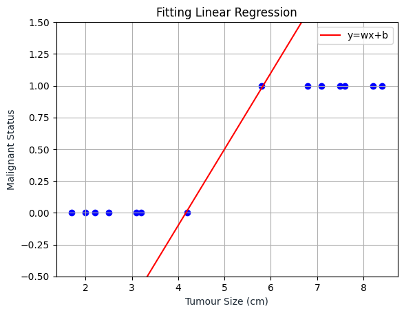
Now let’s try plotting the sigmoid function, keep in mind that if the linear regression is wrong, the result will also be wrong.
As we can see, the Logistic Regression line is somewhere inside the range of 0 and 1 and will always be inside that range.
# Define sigmoid function
def sigmoid(z):
    return 1 / (1 + np.exp(-z))

# Create input range, using min and max of your data
y_sigmoid = sigmoid(y)

# Create scatter plot
plt.scatter(tumour_size, malignant_status, color='blue')
plt.plot(x, y, '-r', label='Linear Regression')
plt.plot(x, y_sigmoid, '-g', label='Logistic Regression')
plt.title('Graph of Linear and Logistic Regression')
plt.xlabel('Tumour Size (cm)', color='#1C2833')
plt.ylabel('Malignant Status', color='#1C2833')
plt.ylim([-0.5, 1.5])  # Set the limits of y-axis here
plt.legend(loc='best')
plt.grid()
plt.show()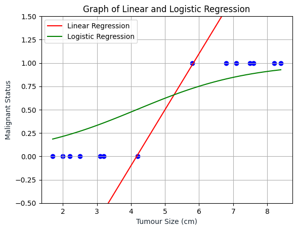
Based on the visualization above, we can say that if a patient comes in and he has a tumor of a certain size, and if based on this input, our model would add 0.6, then what that means is that the model is predicting or the model thinks there is a 60 percent chance that the correct label y will equal 1 for this patient. In other words, the model is telling us that it thinks the patient has a 60 percent chance of the tumor turning malignant.
Now, our question is if \(y\) has a 60 percent chance of being 1, what is its chance of being 0? Don’t we know that \(y\) must be 0 or 1?
The decision boundary is a threshold that determines the class of an output. This output can be interpreted as the probability that a given input point belongs to a certain class.
During the training process, the logistic regression model determines the optimal values for \(w\) and \(b\) to best separate the classes. The model’s output is given by the sigmoid function applied on the weighted sum of the features. This function transforms its input into a value between 0 and 1, which we interpret as the probability that a given input belongs to a certain class. The decision boundary occurs where the model’s predicted probability is 0.5, indicating an equal uncertainty for both classes.
The output of the logistic regression model is given by the sigmoid function of the weighted sum of features, i.e.,
\[ p(y=1|x;\mathbf{w},b) = \sigma(\mathbf{w}^T \mathbf{x} + b) \]
where:
The sigmoid function transforms its input into a value between 0 and 1, which can be interpreted as a probability.
The decision boundary in logistic regression is the point where the model outputs a probability of 0.5. That means the model is equally uncertain about both classes.
If we set the sigmoid function equal to 0.5 and solve for \(z\), we get:
\[ \frac{1}{1+e^{-z}} = 0.5 \]
This simplifies to \(z=0\) after some basic algebra. Because \(z\) is the input to the sigmoid function, and that input is the linear combination of the features (\(\mathbf{w}^T \mathbf{x} + b\)), we get:
\[ \mathbf{w}^T \mathbf{x} + b = 0 \]
Hence, the decision boundary is the solution to the above equation. This is why the decision boundary equation corresponds to a probability of 0.5.
So the equation for decision boundary is:
\(w \cdot x + b = 0\)
Where: - \(w\) represents the weights or coefficients corresponding to each feature - \(x\) represents the feature values - \(b\) is the bias or intercept term
The dot product \(w \cdot x\) sums up the product of each feature value with its corresponding weight. This sum, plus the bias, equals zero at the decision boundary. Thus, the decision boundary marks the threshold at which the model’s predicted probability changes from favoring one class to favor the other.
Let’s apply it to Python code using scikit-learn:
import numpy as np
import matplotlib.pyplot as plt
from sklearn.linear_model import LogisticRegression

# Feature (Tumour Size)
X = tumour_size.values.reshape(-1,1)

# Target variable (Malignant Status)
y = malignant_status

model = LogisticRegression()
model.fit(X, y)

# Calculate the decision boundary
decision_boundary = -model.intercept_/model.coef_
decision_boundary = decision_boundary[0][0]  # Extract the value from the numpy array

# Plot the data along with the decision boundary
plt.figure(figsize=(8,6))
plt.scatter(X[y==0], y[y==0], color='b', label='0: Benign')
plt.scatter(X[y==1], y[y==1], color='r', label='1: Malignant')
plt.plot([decision_boundary, decision_boundary], [-1, 2], "k:", label="Decision Boundary")
plt.plot(x, y_sigmoid, '-g', label='Logistic Regression')
plt.xlabel('Tumour Size (cm)')
plt.ylabel('Malignant Status')
plt.legend()
plt.show()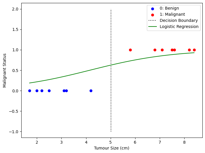
Why in the code above, the calculation becomes decision_boundary = -model.intercept_/model.coef_ ?
Keeping in mind the equation for decision boundary is w.x + b = 0
w is the weight vectorx is the input vectorb is the bias termIn scikit-learn, model.coef_ corresponds to w and model.intercept_ corresponds to b in the above equation.
So if we rearrange the equation w.x + b = 0 to solve for x (the decision boundary), we get x = -b / w.
One more thing, to answer the question from earlier, if y = 0.6, then based on the decision boundary above, it will be marked as 1 (malignant).
The question we want you to answer is, given the training set, how can you choose the parameters \(w\) and \(b\) that will best fit the data? This is where we will again use the cost function.
You might remember that the cost function gives you a way to measure how well a certain set of parameters fit the training data. As such, it gives you a way to try to choose better parameters. The cost function measures how well the logistic regression model is doing on the training data. It quantifies the error between the predicted probabilities (output of the sigmoid function) and the actual class labels in the training data.
Logistic Regression uses a loss function more suited to the task of categorization where the target is 0 or 1 rather than any number.
Loss is a measure of the difference of a single example to its target value while the
Cost is a measure of the losses over the training set
In logistic regression, we use the Log Loss or Binary Cross-Entropy Loss as the cost function.
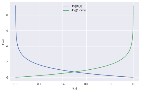
Take a look at the following graph plot:
Source: Miro on Medium
Let’s break it down: - h(x) is the predicted probability of the positive class. This is the output of our logistic regression model, which is the sigmoid of our linear model. The sigmoid function maps any real valued number to the (0, 1) range, which can be used for classification.
The cost function consists of two parts:
-y log(h(x)): This part of the cost function is used when the actual class (y) is 1. If our model predicts close to 1 (h(x) ~ 1), the cost is low, but if our model predicts close to 0 (h(x) ~ 0), the cost is high.
-(1 − y) log(1 − h(x)): This part of the cost function is used when the actual class (y) is 0. If our model predicts close to 0 (h(x) ~ 0), the cost is low, but if our model predicts close to 1 (h(x) ~ 1), the cost is high.
Let’s plot the first part -y log(h(x)) where y = 1. With simple math, we substitute y with 1 to get -1 log(h(x)) which can be written as -log(h(x))
import numpy as np
import matplotlib.pyplot as plt

# Predicted probability range from 0 to 1
h = np.linspace(0.000001, 0.999999)

# Cost when y=1
cost = -np.log(h)

plt.plot(h, cost)
plt.xlabel('Predicted Probability')
plt.ylabel('Cost')
plt.title('Cost Function for y=1')
plt.show()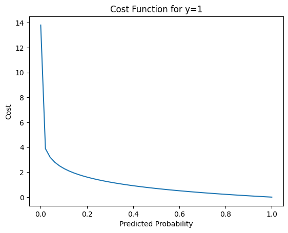
We then plot the cost when h(x) is close to 0, let’s say 0.000001 to a number close to 1, let’s use 0.999999. We can see that as the predicted probability h(x) is closer to 1, the cost went down significantly, which is what we want.
Now, let’s plot the second part -(1 − y) log(1 − h(x)) where y = 0. Again, with simple math, we substitute y with 0 and we get -(1)log(1 - h(x)) which can be written as follows -log(1 - h(x))
import numpy as np
import matplotlib.pyplot as plt

# Predicted probability range from 0 to 1
h = np.linspace(0.000001, 0.999999)

# Cost when y=1
cost = -np.log(1 - h)

plt.plot(h, cost)
plt.xlabel('Predicted Probability')
plt.ylabel('Cost')
plt.title('Cost Function for y=0')
plt.show()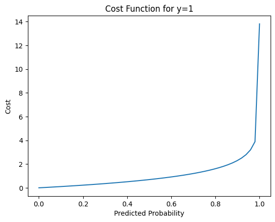
Again, we plot the cost when h(x) is close to 0, let’s say 0.000001 to a number close to 1, let’s use 0.999999. We can see that as the predicted probability h(x) is closer to 0, the cost went down significantly, which is what we want.
This cost function works well because it “penalizes” wrong predictions with a high cost, and rewards correct predictions with a low cost. The goal of our training process is to find the parameters of our model that minimize this cost function.
In other words, we adjust the parameters of our model to make our predictions as close as possible to the actual classes, thereby minimizing the cost.
Combining them together, we get:
\[loss({h}(\mathbf{x}), y) = -y \log\left({h}\left( \mathbf{x} \right) \right) - \left( 1 - y\right) \log \left( 1 - {h}\left( \mathbf{x} \right) \right) \]
This formula holds true because when y = 0 (we substitute y with 0):
-0 log(h(x))-(1 − 0) log(1 − h(x)) => -log(1 - h(x)) which is the same as the second part where y = 0.
and when y = 1 (we substitute y with 1):
-1 log(h(x))-(1 − 1) log(1 − h(x)) => -log(h(x)) which is the same as the first part where y = 1.
To get the total cost for all of our training data, we need to find the average of the individual loss function:
\[ J(\mathbf{w},b) = \frac{1}{m} \sum_{i=0}^{m-1} \left[ loss({h}(\mathbf{x}_{(i)}), y_{(i)}) \right] \]
where m is the number of instances in our training set.
Now, let’s move on to the implementation:
Look at the code below, where we use compute_cost_logistic to calculate the loss for each example and accumulating the total.
def sigmoid(z):
    """
    Compute the sigmoid of z

    Parameters
    ----------
    z : array_like
        A scalar or numpy array of any size.

    Returns
    -------
     g : array_like
         sigmoid(z)
    """
    g = 1.0/(1.0+np.exp(-z))

    return g


eps = 1e-7 #added for numerical stability, to avoid getting the value of 0 or 1
def compute_cost_logistic(X, y, w, b):
    """
    Computes cost

    Args:
      X (ndarray (m,n)): Data, m examples with n features
      y (ndarray (m,)) : target values
      w (ndarray (n,)) : model parameters
      b (scalar)       : model parameter

    Returns:
      cost (scalar): cost
    """

    m = X.shape[0]
    cost = 0.0
    for i in range(m):
        z_i = np.dot(X[i],w) + b
        f_wb_i = sigmoid(z_i)

        cost += -y[i]*np.log(f_wb_i + eps) - (1-y[i])*np.log(1-f_wb_i + eps)

    cost = cost / m
    return cost
import numpy as np
X_train = np.array([[7.1, 55], [3.2, 30], [5.8, 65], [2.0, 20], [8.4, 72],
[4.2, 40], [7.6, 60], [2.5, 25], [6.8, 70], [1.7, 22],
[7.5, 68], [3.1, 35], [8.2, 66], [2.2, 28]])
y_train = np.array([1, 0, 1, 0, 1, 0, 1, 0, 1, 0, 1, 0, 1, 0])
w = np.array([1,1])
b = -6
cost = compute_cost_logistic(X_train, y_train, w, b)
print(f"Number of errors: {cost}")Number of errors: 7.9914896501466695Based on the data owned and the value of \(w\) and \(b\), when viewed from the results of the compute_cost_logistic function, the total mistakes we got were 7.9915.
Then, is the best amount? Then how do you do it? In other words we want to get the best \(w\) and \(b\) values that make the lines as close as possible to the spread points.
Again, at this stage we can use the Scikit-learn library.
Just like Linear Regression, for our Logistic Regression model, sklearn provides the LogisticRegression class in the sklearn.linear_model module.
Here’s how you can do it:
import numpy as np
from sklearn.linear_model import LogisticRegression

# your data
x_train = np.array([[7.1, 55], [3.2, 30], [5.8, 65], [2.0, 20], [8.4, 72],
              [4.2, 40], [7.6, 60], [2.5, 25], [6.8, 70], [1.7, 22],
              [7.5, 68], [3.1, 35], [8.2, 66], [2.2, 28]])
y_train = np.array([1, 0, 1, 0, 1, 0, 1, 0, 1, 0, 1, 0, 1, 0])

lr_model = LogisticRegression()
lr_model.fit(x_train, y_train)

coefficient = lr_model.coef_
intercept = lr_model.intercept_
print(f"Coefficients: {coefficient}")
print(f"Intercept: {intercept}")
Coefficients: [[0.08773648 0.4661736 ]]
Intercept: [-22.63354811]From the results of the code above, the \(w\) (coefficient) value is 0.08773648 and 0.4661736, and for \(b\) (intercept) is -22.63354811. That way we can produce the minimum possible error/loss value. Now we look again at the data we have with the new \(w\) and \(b\) values and what error/loss we get.
w = np.array([0.08773648, 0.4661736 ])
b = -22.63354811

cost = compute_cost_logistic(X_train, y_train, w, b)
print(f"Number of errors: {cost}")
Number of errors: 0.004169320992196987We can see that the error/loss has decreased from 7.9914 to 0.0042. In this way, the accuracy of tumor classification will increase.
Besides helping us determine the right values for the \(w\) and \(b\) parameters, the sklearn library can also help us calculate the accuracy of our data. Let’s start with the dataset and the prediction made by this model by calling the predict function:
Prediction on training set: [1 0 1 0 1 0 1 0 1 0 1 0 1 0]Now, we can calculate this accuracy of this model by calling the score function. The output of score is a scalar in the form of a float number between 0 and 1 indicating the percentage of samples correctly classified by the model. - 1: the model successfully classified all samples correctly - 0: the model failed to classify all samples.
If you look at the score result (1), it means that the model we used successfully predicted all the labels correctly for the given dataset. In other words, the model has 100% accuracy based on the data we used in the score method.
However, it is necessary to be careful in evaluating this result.
Overfitting: If you see 1 or 100% accuracy on the training dataset, the model may have overfit. That is, the model may have learned the details and noise on the training dataset specifically, at a level where it goes beyond learning the underlying concepts. Overfitting causes the model to be unable to generalize well to new data. We’ll cover more on overfitting later on in the course.
Evaluation on Training Data: If you use training data for evaluation (which is done when you call back training data for score), then the results tend to be overoptimistic because the model has ‘seen’ this training data before. It is always important to evaluate the model’s performance on validation or testing data sets that the model has not ‘seen’ to get an unbiased estimate of how the model will perform on data that it has not seen before.
Data is Easy to Predict: In some cases, the data may be simple enough or the patterns clear enough that the model is able to achieve 1 accuracy. However, this tends to apply to simple or synthetic datasets, and rarely to complex and messy real-world data.
So while a 1 score may initially seem like a great result, it could be a sign that you need to examine in more detail how your model works and how you test your model.